
Design Speak: Serif and Sans Serif
I realize that sometimes it seems like graphic designers (and printers) have their own language. I’ve started the Design Speak series here on my blog so I can help clarify some of these terms you may hear, but not totally understand.
Basically, serif fonts have serifs. Sans serif fonts don’t have serifs. But you might of been able to guess that part. So, what is a serif?
A serif is the little lines at the ends of individual characters. Sometimes people refer to them as little feet, which seems cute.
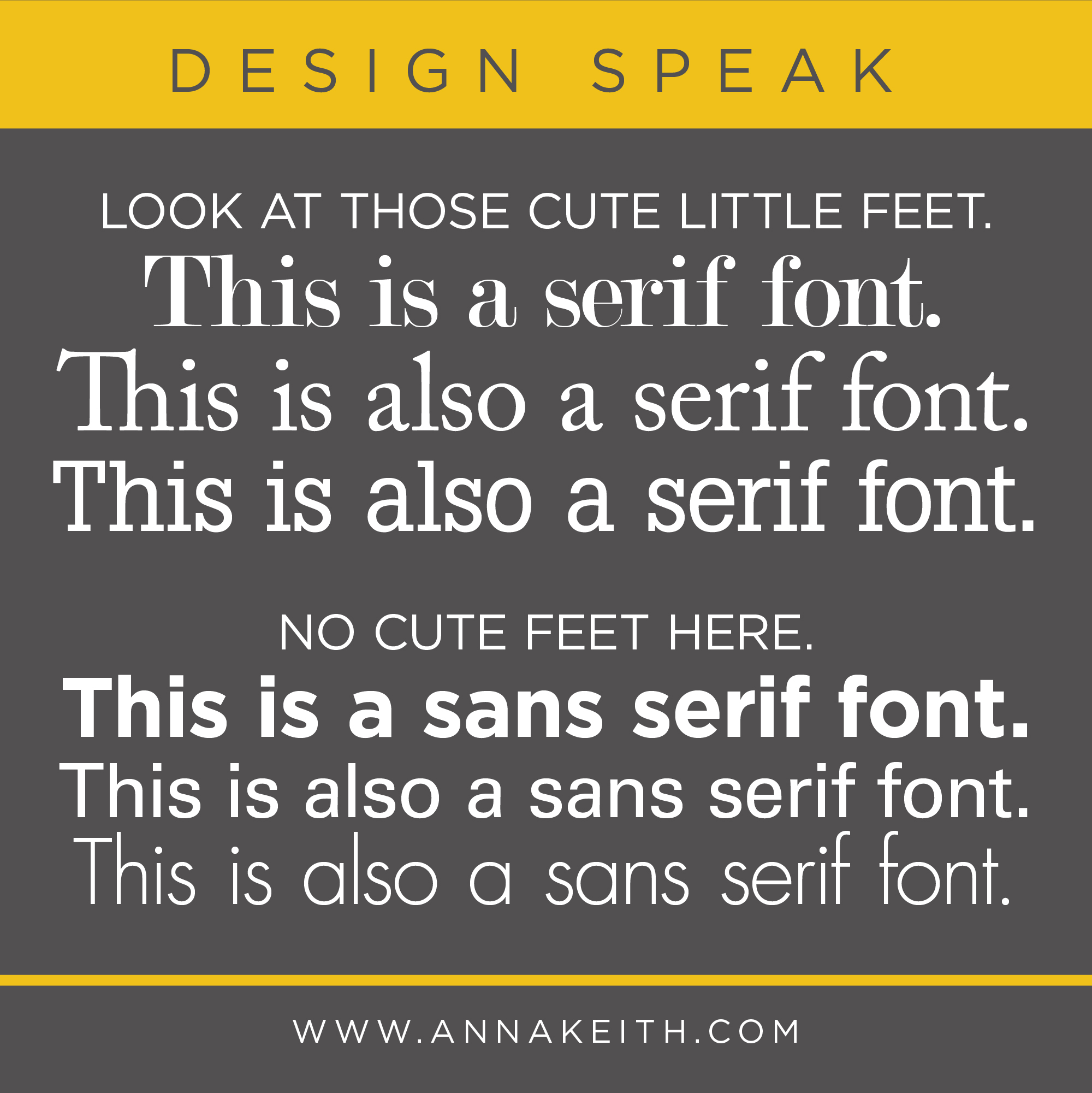
Serifs are considered decorative, but historically also served a function – serif typefaces were thought to be easier to read because those cute little serif feet helped the eye travel across a line of text. This is why you often see serifs in books or as the body copy for newspapers. On the flip side though, serifs can make it harder to read text when its pretty small. All in all, because we have so many fonts to choose from these days, there are plenty of sans serifs that are easy to read, and especially when designing for kids, sans serifs are ideal, because the characters are generally less complex and easier to recognize for new readers.
When picking a font, you want to consider readability (of course!) but also what kind of attitude and vibe it has. Generally, serifs are seen as more traditional and sans serifs may seem more modern, but again, with the wide variety of fonts available these days, that doesn’t always hold true.

