
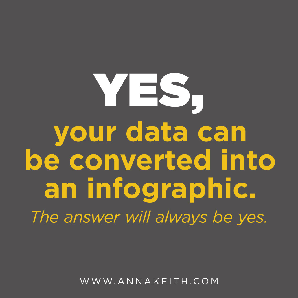
Yes, your data can be an infographic.
In the past couple years, infographics have exploded all over the web.
But they’ve been around long before that. Infographics are simply visual representations of data. That includes everything from maps to graphs to the weather icons you see in the newspaper.
So can your data be an infographic? Yes, the answer is always going to be yes. If you’ve got information to share, you can represent it visually. Here are just a few of the possibilities:
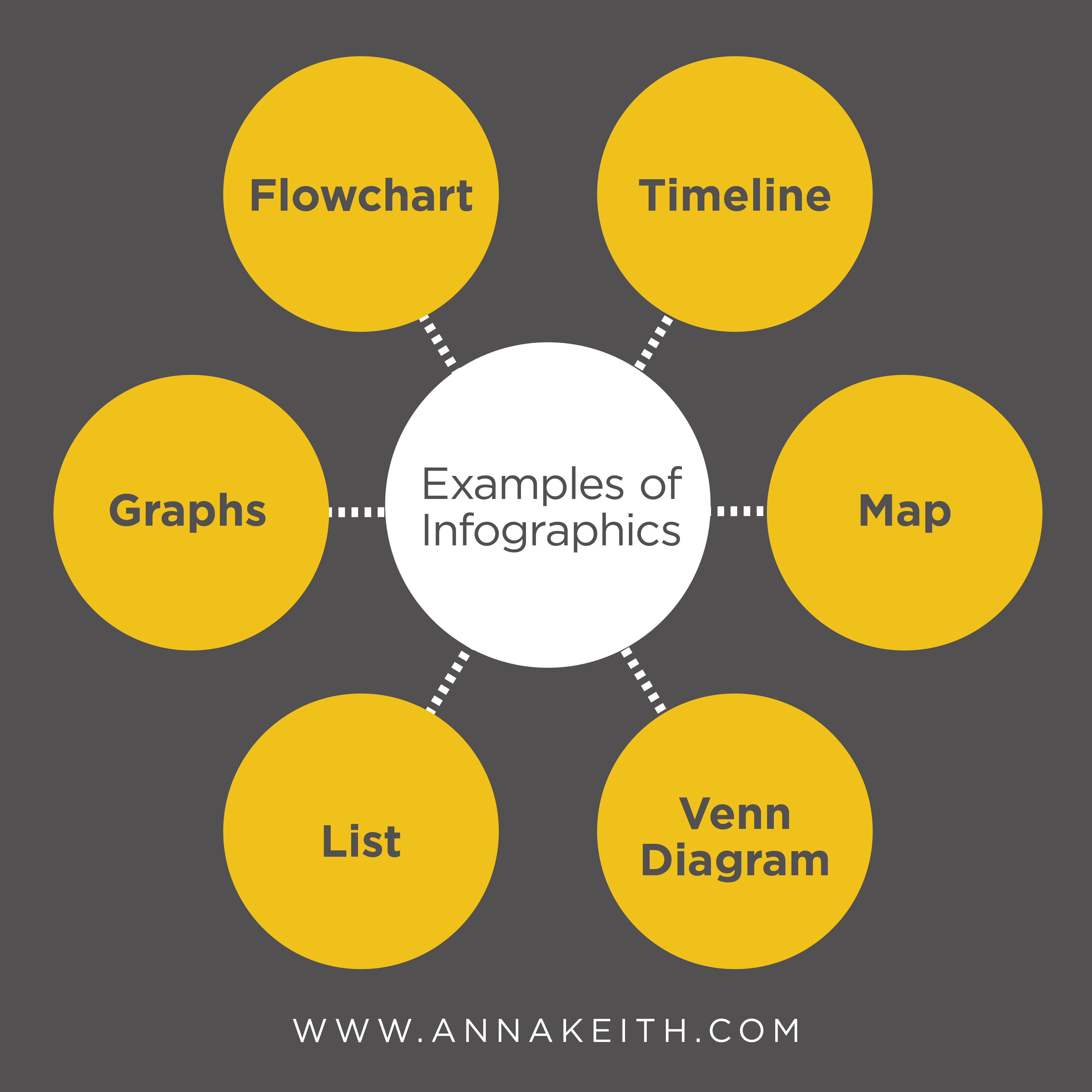
- Pie graphs or line graphs are great for when you’ve got numbers, like percentage breakdowns or other growth.
- A flowchart is often used to answer a question by giving the reader choices.
- A timeline is used to display chronological data.
- A map shows locations.
- A venn diagram or charts shows a comparison.
- A list can be used for tips or a step-by-step.
Even if your data doesn’t seem to perfectly fit into one of the examples above, you can still present it visually. It’s called a visualized article, and you use combinations of icons, illustrations or images to break and article into easily understood information. Since the brain processes images faster than text, getting your point across ASAP is ideal.
Here are a few infographics I’ve created for clients. If you’d like to work together on an infographic project, send me an email to learn more at anna@annakeith.com.

Leave a Reply
Want to join the discussion?Feel free to contribute!