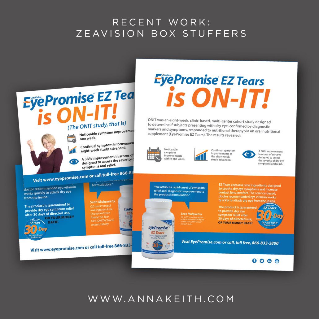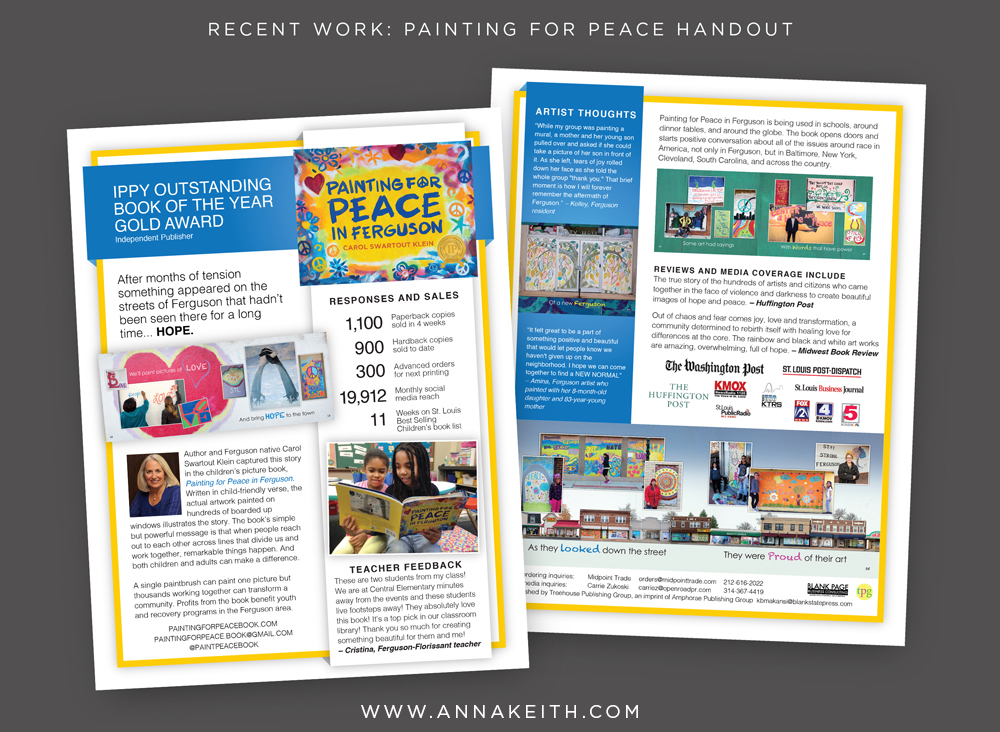
Client work: TransStates Turn Timeline
I’ve been helping out the marketing team at TransStates airlines for about 6 months. TransStates flies on behalf of United Airlines (as United Express) and American Airlines (as American Eagle), so while I didn’t realize it at the time, I’m sure I have (and maybe you have!) been a passenger on one of their flights. Since we starting working together, I’ve helped them with design for everything from web banners to photo editing to brochures, and just recently wrapped up the Turn Timeline, an infographic poster.
The poster illustrates the roles and responsibilities of different staff members during the 24 minutes a flight is at the airport. The previous version was in black and white and it wasn’t user friendly. (You can see it below.) I used color coding and separate rows to make it clear which crew member was responsible for which task, and when each crew member had a break. Additionally, the colorful piece is now much more eye-catching, as opposed to the before version.
The Turn Timeline is used for both American Airline and United Airline flights, so we intentionally didn’t use the logo and branding from either one. The poster will be displayed in crew areas so it can be easily referenced on the go.
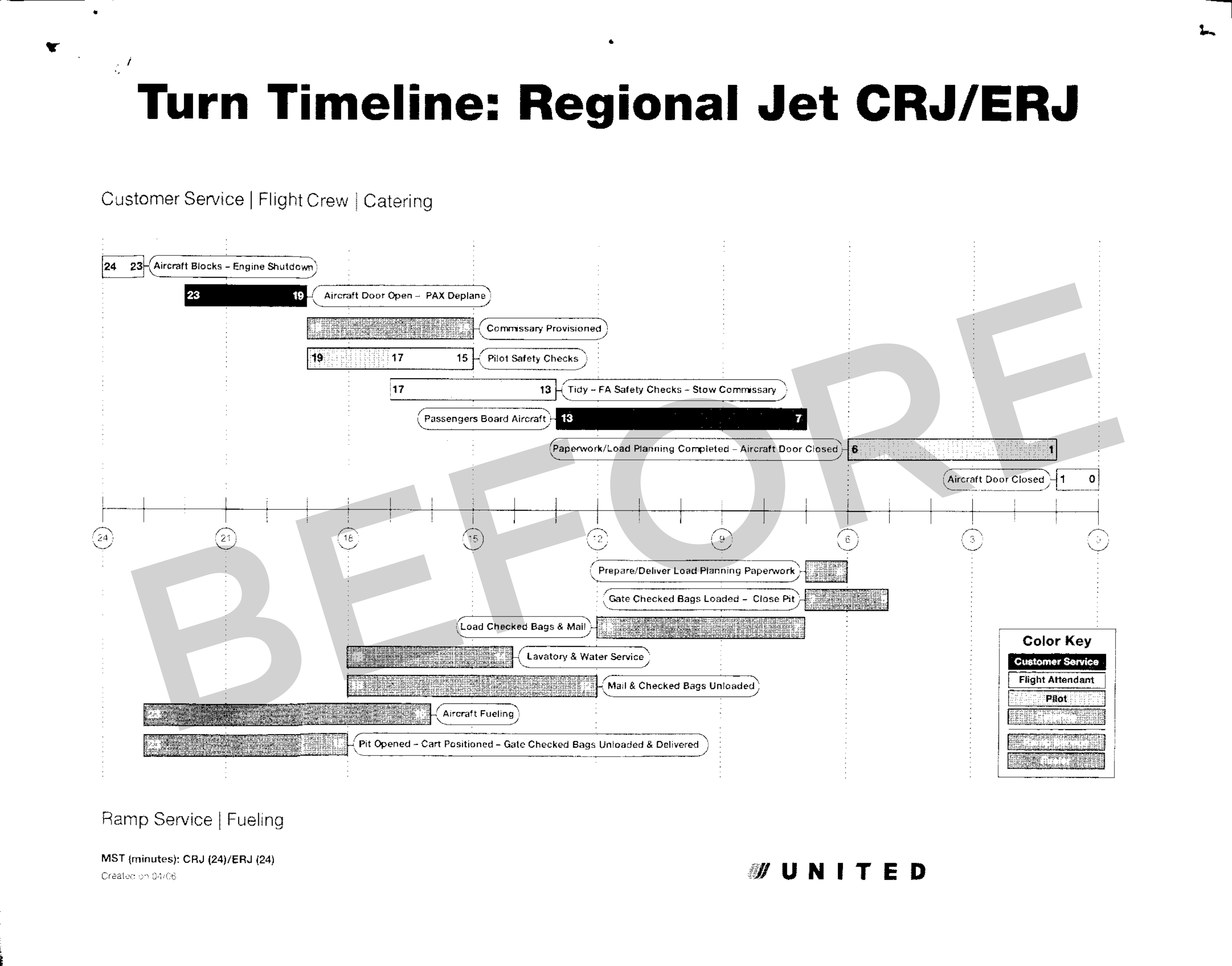
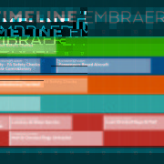
Turn Timeline Before
Turn Timeline for TransStates Airlines – the final design.